Reimagining a holiday search journey for The Times Expert Traveller.
I was asked to work alongside The Times’ design team to deliver a complete redesign of the trip pages of The Times Expert Traveller website. The team wanted these pages to integrate with the existing website, adding cohesion to a user’s journey.
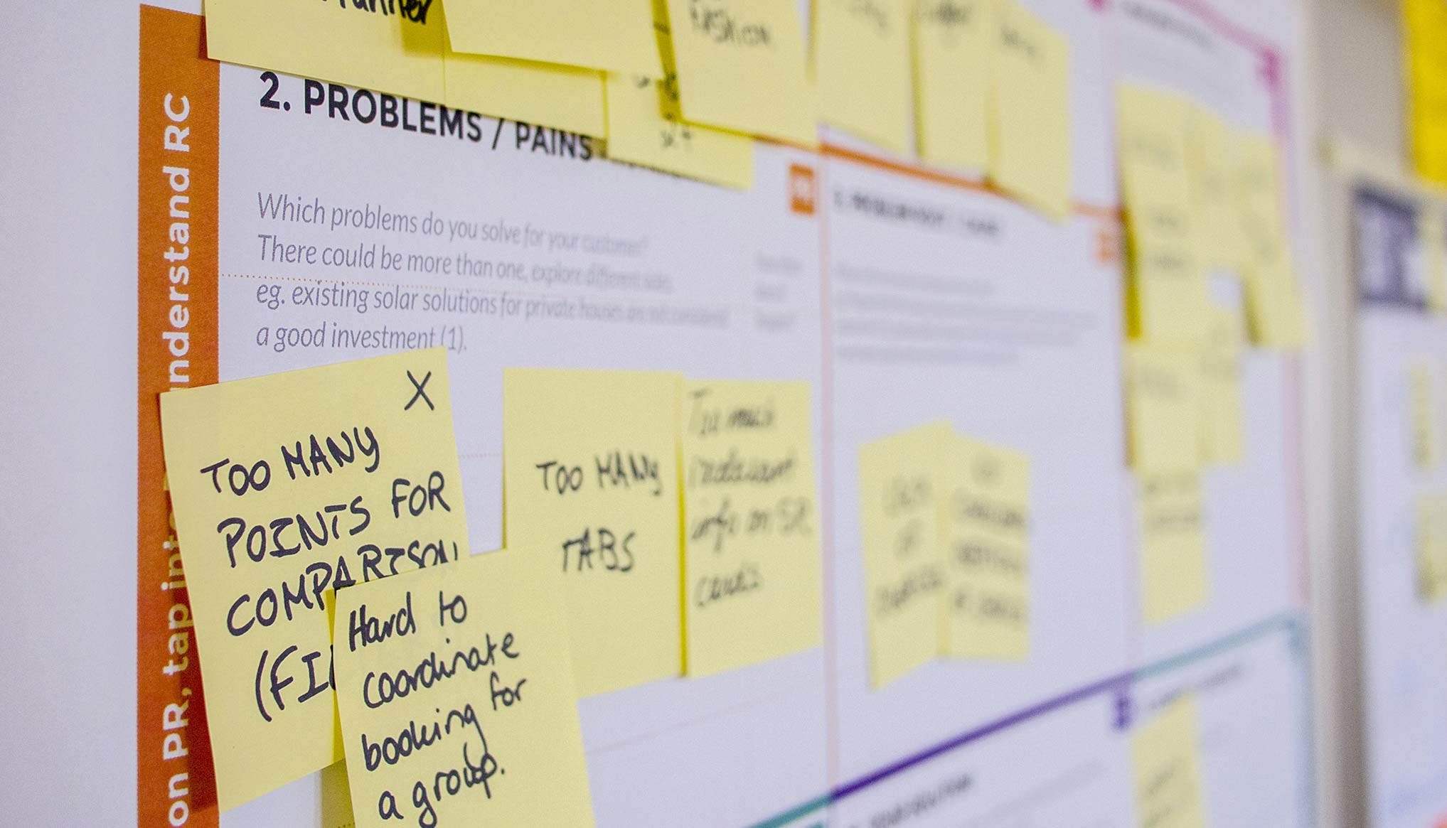 ^ Initial planning & brainstorm
To kick off this project we undertook a discovery workshop, in order to identify the main aims, timelines and structure of the project.
The majority of the work needed to be completed remotely. Therefore, setting up a close collaboration with The Times team from the start was key to getting the project off the ground. We set up weekly catchups and developed a sign-off process to ensure key stakeholders were involved throughout the entirety of the process.
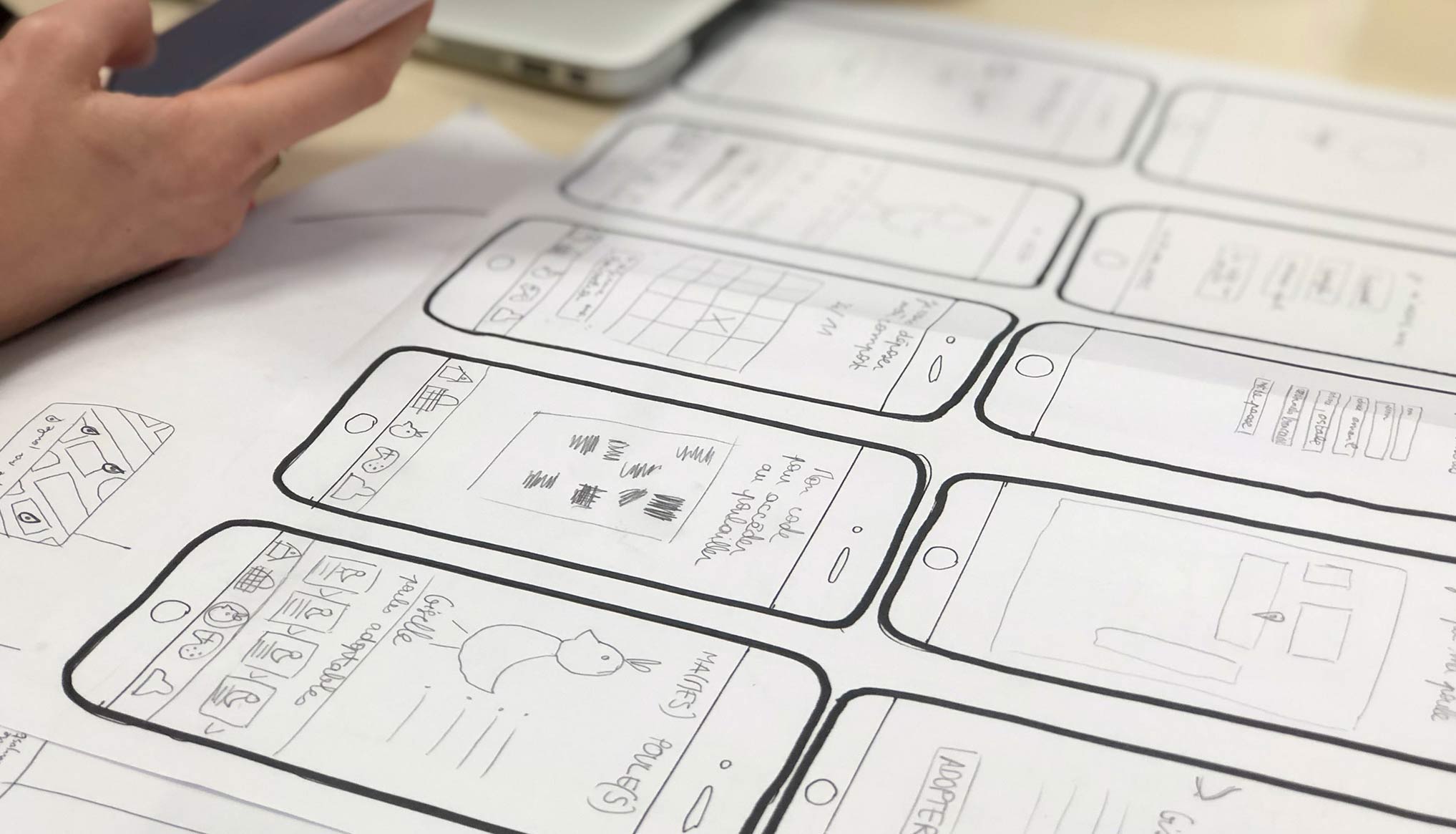 ^ Sketching out mobile screens 🖍
I completed a full analysis of the current UI of The Times’ website. This was to ensure any recommendations I made were visually consistent with the rest of the online journey and The Times’ brand. However, it also ensured I looked at the task from a high-level standpoint, ensuring I focused on the pages as a part of a wider website, rather than in silo.
I storyboarded key user journeys and touch points. This enabled me to highlight any problem areas within the journey; I also identified redundant tasks, or steps that could be removed.
The mapping process identified the lack of search functionality, as well as several components that needed attention from a usability standpoint. Furthermore, I was able to identify the beginning, middle and end steps of a user’s journey and suggest a design that would more accurately guide users through this journey.
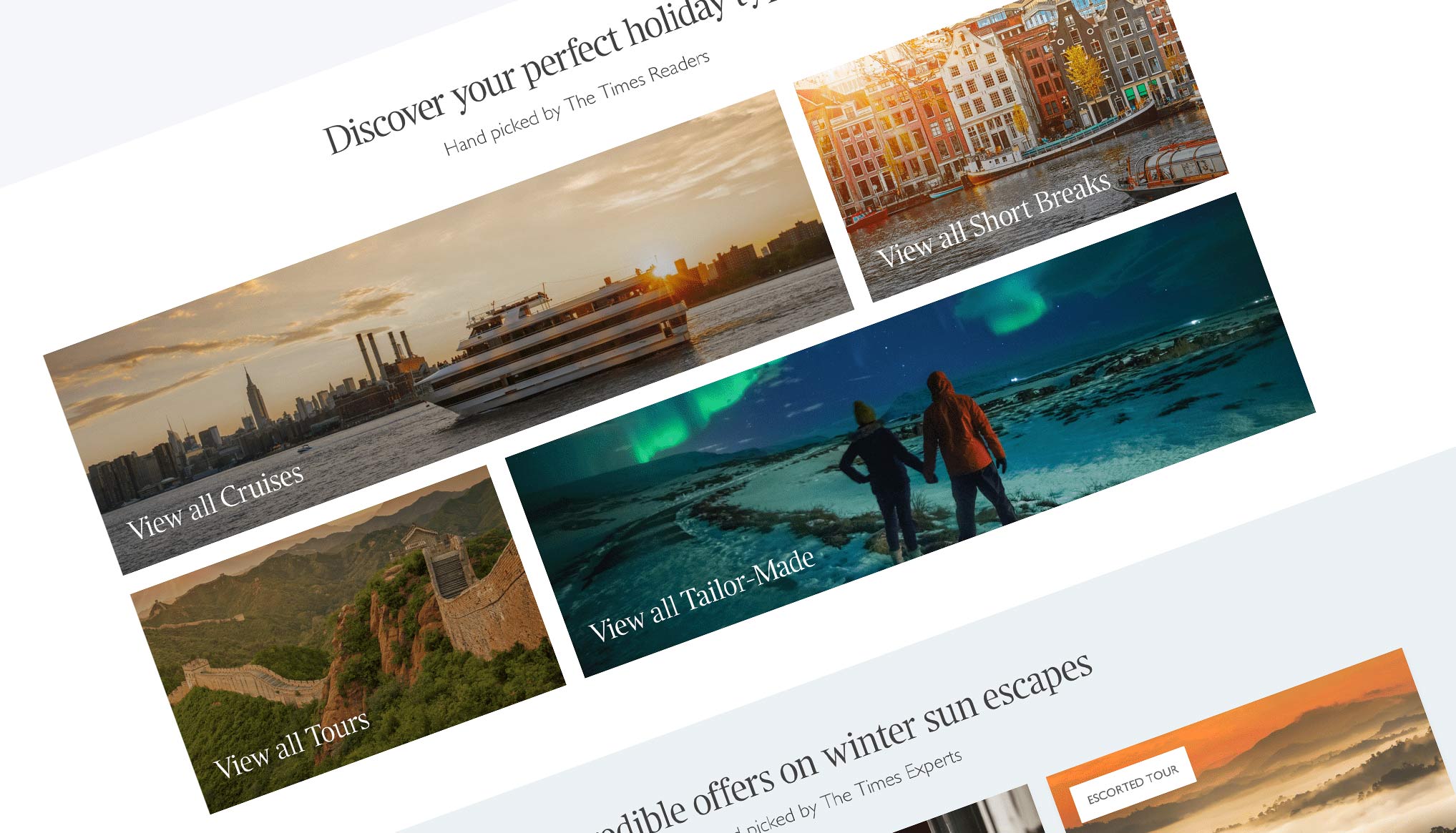 ^ The destination imagery hard at work
I got to work redesigning the landing page for all devices. I also redesigned the product page, which involved create a template that could be populated by the different products’ content.
The original landing page had several problems to solve. Each component was broken down, analysed, redesigned and then rebuilt. The page was information heavy, it was unclear what actions were available to the user. I tackled this in my design by lowering the cognitive load of individual UI components.
I reduced information density and minimised the physical effort required to perform tasks. I then chunked information and built new components to correctly highlight the most relevant information ensuring the page hierarchy was clear. In addition, I embedded a search functionality with my design. I also designed a new search results pages to aid the additional user step.
The data showed that the product pages had a high time spent on page, however this was coupled with an abnormally high bounce rate. I deduced that the users couldn’t find what they were looking. To inform my new design, I analysed the user interactions on the page to see how to best guide them.
I created components that stuck key information to the pages, such as a sticky navigation that included pricing. I also designed a sticky widget that stuck to the view port. This offered users a live chat or helpful email form.
I also completed a full redesign of the pricing tables. I introduced collapsible elements such as dropdowns and carousels to try and tackle some the larger chunks of content.
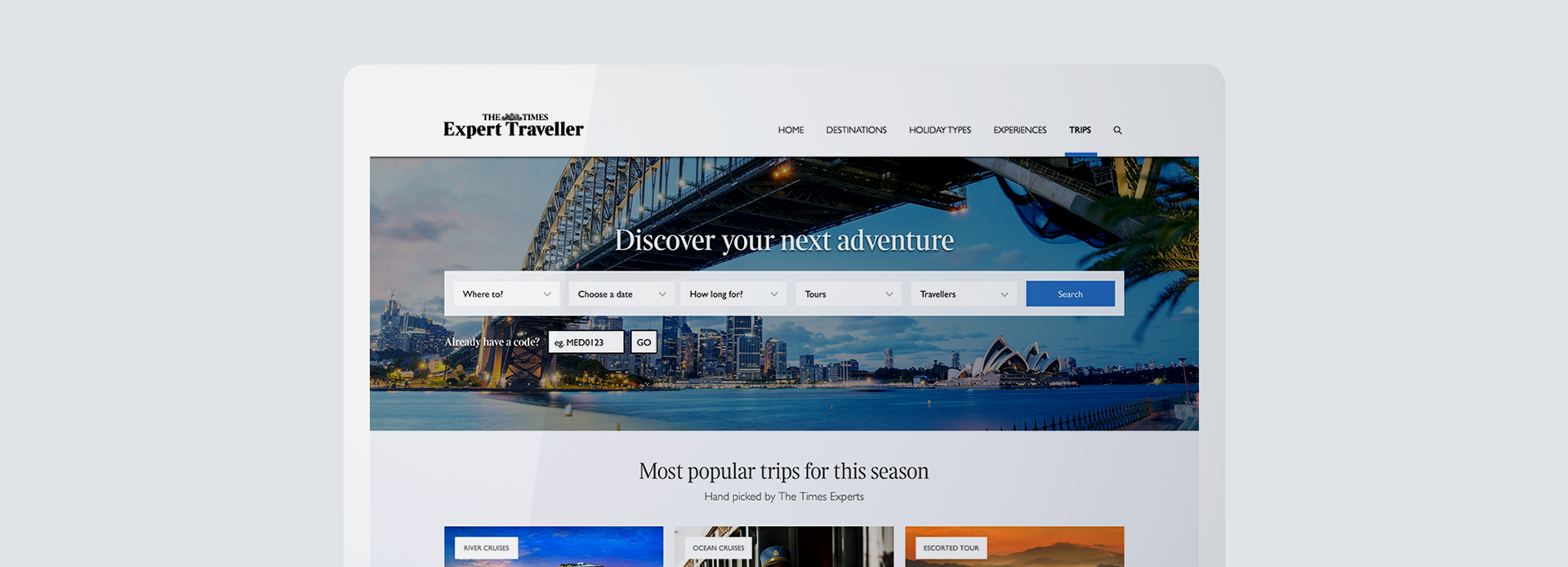
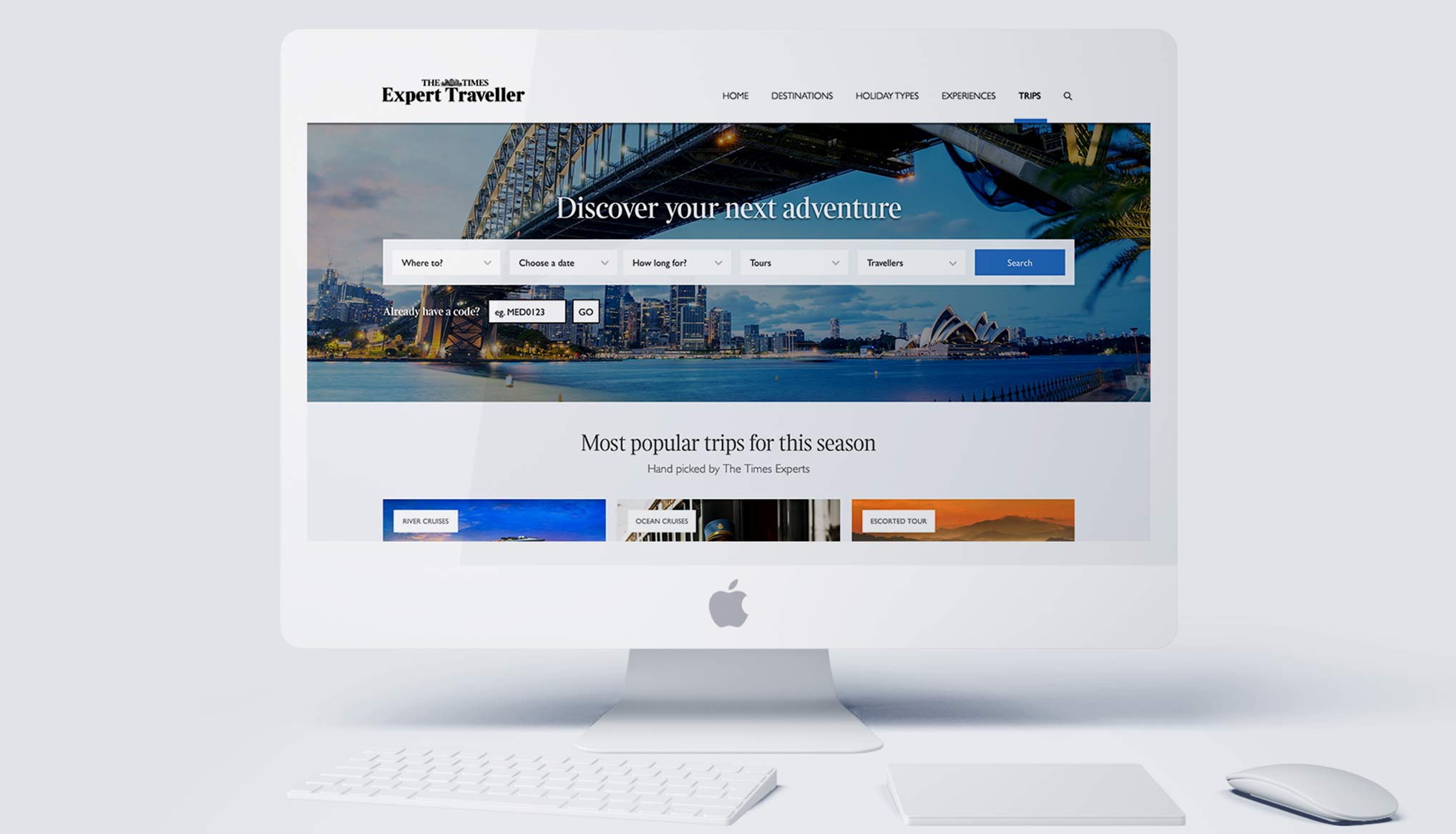 ^ A look at the new homepage 🙌
A new site architecture, better UX, and new elements added to the brand design system.
I focused on improving the user experience and simplifying the site architecture. I brought consistency to the trip section of the website and aligned it with The Times’ travel articles.
By focusing on information architecture and the hierarchy of content, as well as the wider user journey, I was able to seamlessly introduce a functional, on-brand and user-focused trips area to The Times’ website. Their users can now easily search the wealth of information to find the offer that suits them best. I also addressed the high bounce and read rate by introducing the new helper features.
Design Lead
Imagine Cruising
2019
Design Systems
Design Ops
Documentation
Sketch
Invision
Creation of a fresh brand identity.

A new design system for Imagine Cruising.
Native screens and dashboard design.