A dashboard redesign and mulitple native screens notifying both landlords and their tenants on bookings and payments.
I was tasked with creating native app designs for a digital letting agency based in Bristol. The design had two main tasks. The first focused around notifying tenants after a cancellation has been made by their landlord. The second was to create a dashboard for the landlords to manage their properties.
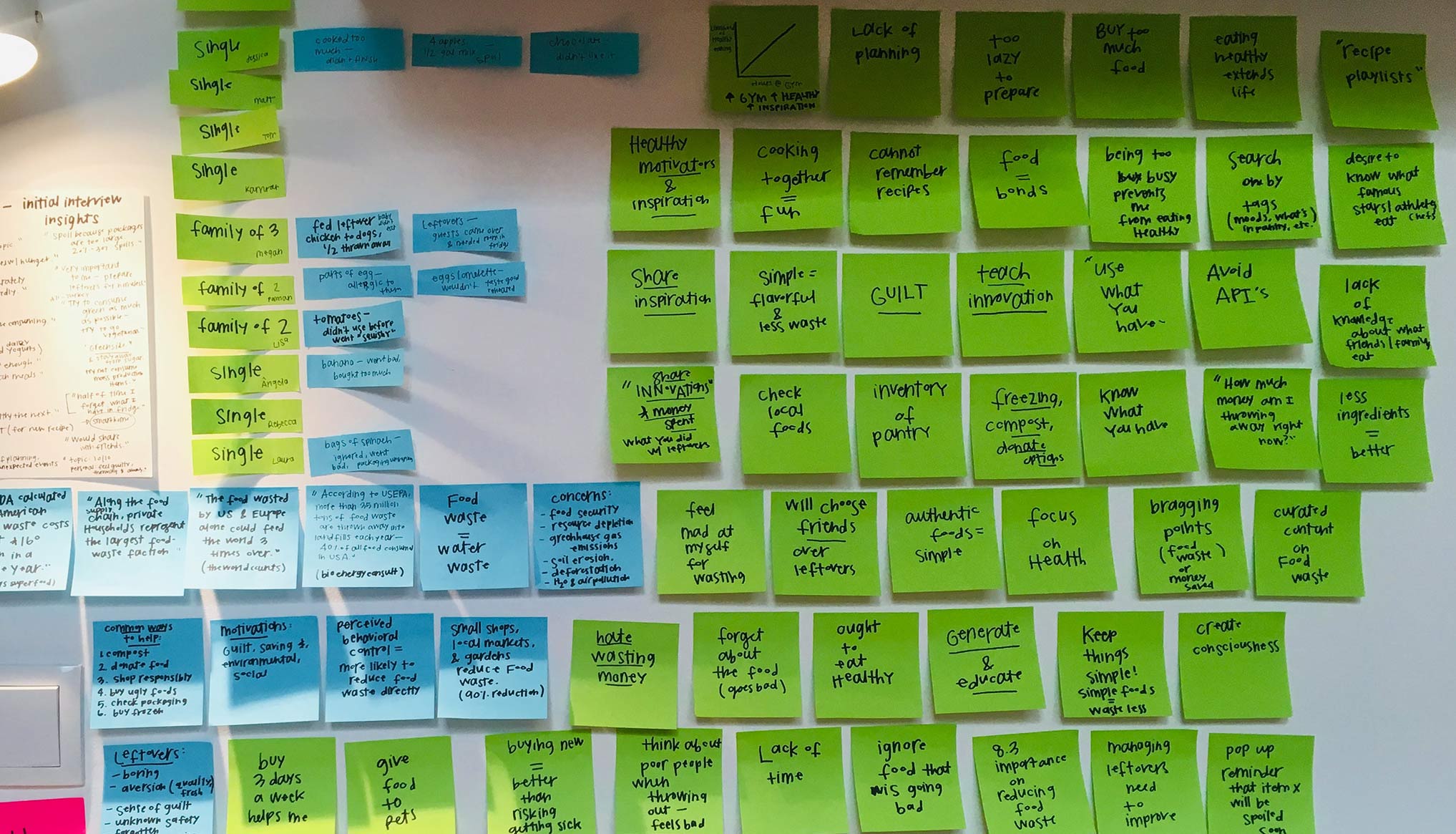 ^ Finding the right tasks 🤔
I wanted to approach both tasks from the perspectives of the tenant and landlord. I chose to lean on completed user research to set up scenarios based off the research-established personas. This helped to create a design that empathised with real users and was anchored in real life scenarios.
A tenant has had their viewing rejected by a landlord only a few hours before it was scheduled. They have their phone.
The cancellation notification journey was broken into two distinct user journeys that focused on getting the right message triggered at the right time and helped the tenant make the best next step. This journey utilised in-app messaging, email marketing and SMS notifications to inform the user. All triggers were based on urgency and past interactions.
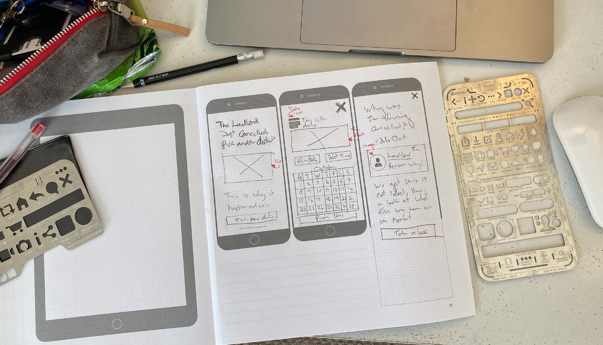 ^ Sketching out ideas...
The first message had a three-pronged attack based on where the user was and how easily they could respond. If the user had interacted with the App within the last hour, I planned to send out a notification that informed the user they had a cancellation and that they should log back into the app for next steps.
If the user didn’t interact with this, it was taken as not being been seen by the user and was followed up with a SMS and email notification. Similarly, if the user hadn’t recently been on the app, an email and SMS were sent out. This more forceful notification was based on the idea the user may be likelier to view an SMS/email. All urgency was focused around contacting them before they wasted their time trying to make it to the now cancelled viewing.
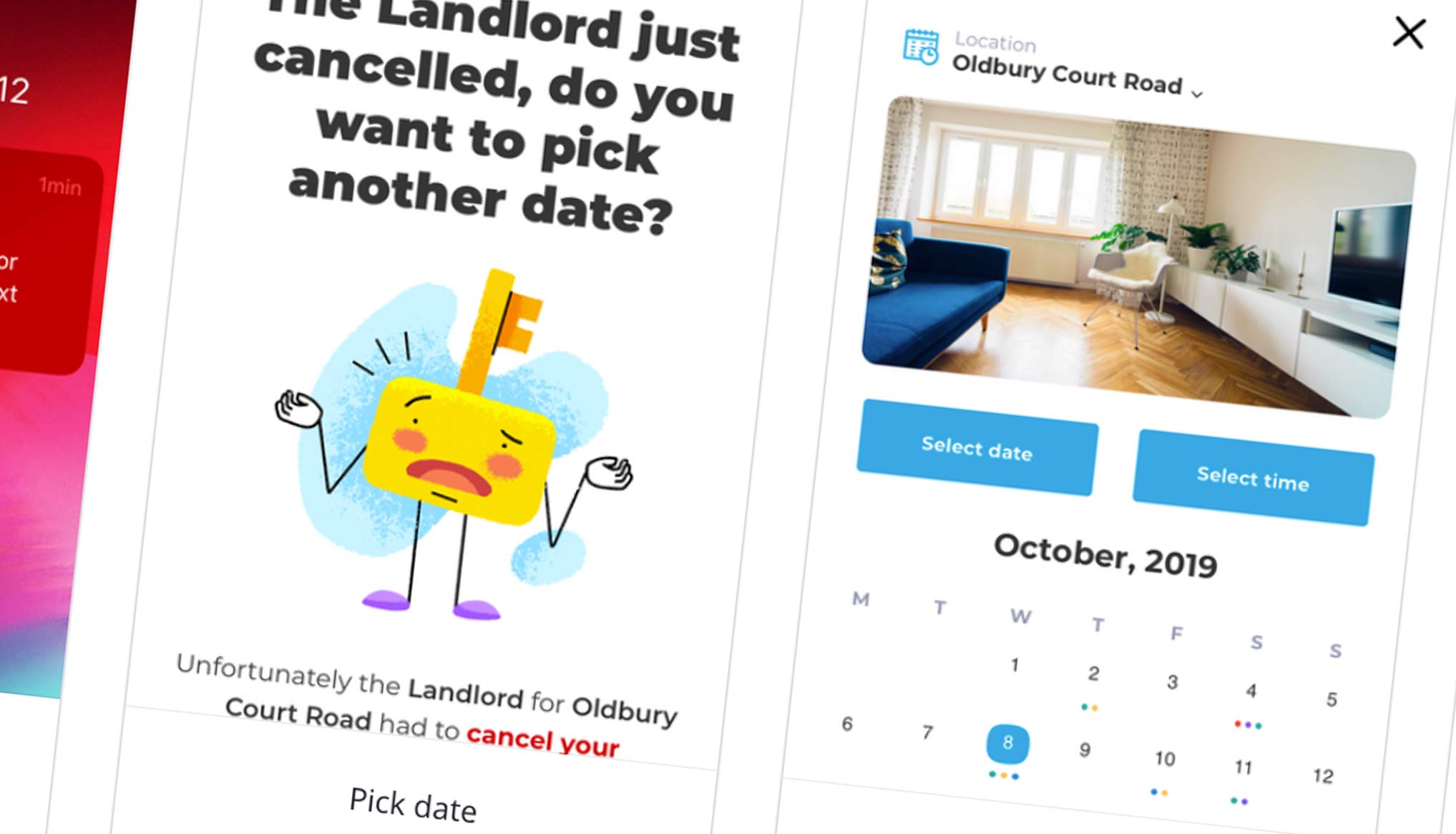 ^ Notifications & calendar 📅
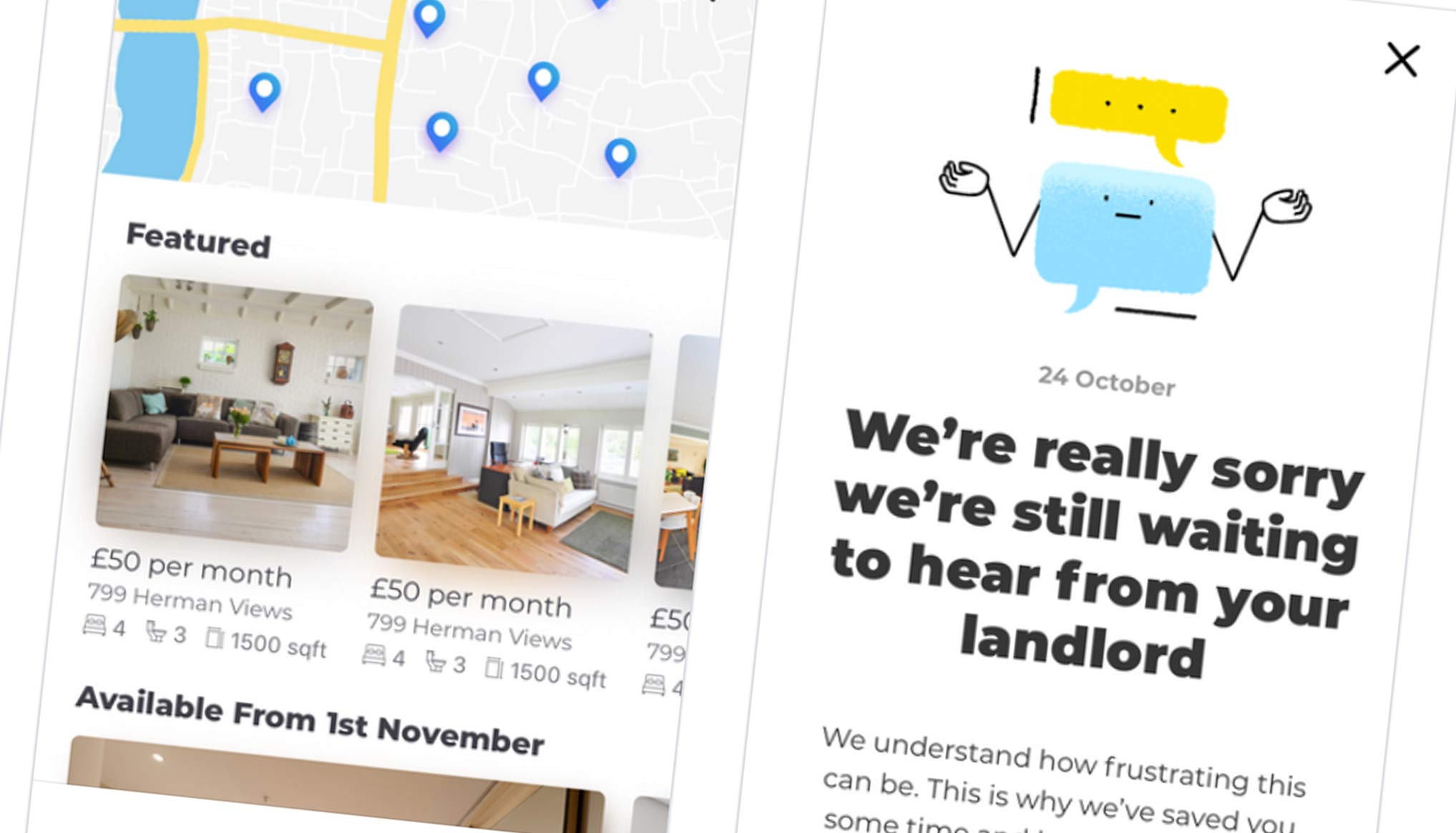
Once on the RENTR app, the user is presented with next step and the reasoning behind the cancellation of their viewing. For example, the property has since been removed from the website and is no longer taking bookings.
In the fast-paced rental market this scenario is common, leading to high user frustration. To tackle this, the messaging led with an apology and routed the user straight to any similar properties in the area. By taking ownership of the situation (not that RENTR controls it, but they do facilitate) the journey was designed to resolve the problem for the user.
The design included a secondary CTA that centred on transparency. This was a chance for the user to find out more about the incident and if the landlord had left any notes.
The second scenario I focused on was one where the landlord had pulled out last minute, but there was still an option to book in on another date. This journey lead the user to a calendar that had both the landlord’s and user’s information. This way, the user can now pick the next best time and rebook.
For full transparency, the design offers the user the chance to see what the reasoning is for the cancelation. This ensure the human behind the app remains present and gives a chance for unforeseen circumstance to be captured and played back at the right time to hopefully minimise frustration.
 ^ Linking to further products
The scenario presented was that of a landlord who has returned to the website on their laptop and has seen that some of their tenants’ rent is now overdue. For the second task, I focused on helping landlords better communicate with tenants and also showed a summary of any late payments.
 ^ Creating a logical dashboard flow 🤓
The main problem sits with the landlord being able to distinguish that a late payment has occurred, who this was from, how much they are owed and how to rectify this. RENTR itself is a self-service platform, so any problem will be down to the landlord to deal with themselves.
After determining the needs of the landlord, I focused in on information hierarchy to ensure the user has immediate access to the relevant information. This also played into choosing the right type of data visualization to keep the design legible and easy to digest.
By striving for simplicity and usability, I created a simple layout. It consisted of a quick search at the top of the dashboard and a notification centre to the right. The left hand was then free to tab though important subheadings relevant to property management such as: billing, tenants, calendars, documentation, chat and the dashboard settings.
To notify the landlord on the late payment, I utilised colour and alert messaging to signify that something is out of place and what to do next. On the right, red is used to show their new messages, which this alert would sit under. There is also a date stamp on the notification and a link to help the user view which tenants are overdue.
Once on the tenant’s page, the user is greeted with an overview of all their tenants and an additional message on payments. By clicking this, the list of tenants is filtered by payment and any discrepancies are immediately visible. The landlord is then prompted to contact the tenant. After one click, the landlord is given in-depth detail on who they are, what property they are at, how much they are overdue, if there has been any correspondence and their contact information.
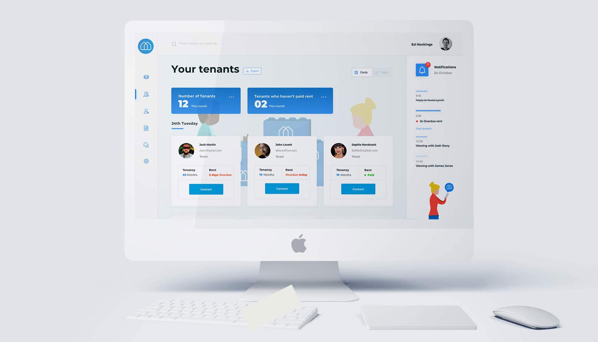 ^ A look at the new dashboard
A usable, scalable, mobile-friendly platform along with two engaging notification-based journeys.
The notification-based journeys are designed to quickly inform tenants and remove friction from the process of booking and attending viewings. The design takes ownership when something doesn’t go quite as planned and offers up the next best step to keep the user engaged.
The dashboard keeps the user at the heart of the product by signifying exactly what is wrong and logically linking the landlord to the right information. It focuses on brand experience and usability to keep retention high.
Design Lead
Imagine Cruising
2019
Design Systems
Design Ops
Documentation
Sketch
Invision
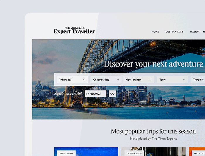
Reimagining a holiday search journey.
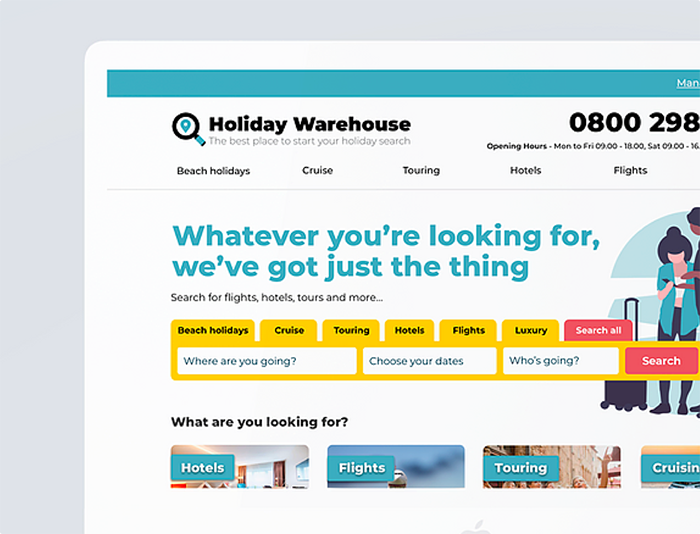
Creation of a fresh brand identity.
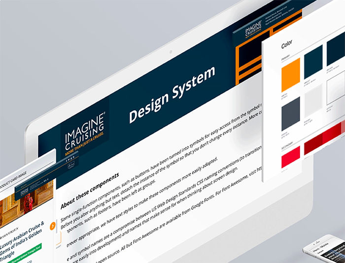
A new design system for Imagine Cruising.