A design system to aid rebranding a commercial cruise website.
Imagine Cruising embarked on a full rebrand of their website in 2019. As one of the senior designers, I was tasked with creating a cohesive and consistent design system to aid the new build.
I was responsible for creating the single source of truth in sketch for dozens of components. I based the visual language on the brand identity, along with best practice. The final project encompassed marketing material, digital assets and was delivered with supporting documentation.
Finding the right place to start with a full redesign can seem a bit daunting at the beginning. Where do you even start with a job of this size? I ended up breaking the ideation into three sizable chucks that helped me fully understand the size of the task and what direction to head in.
 ^ Starting of with a little research... 🤓
To kick things of, I wanted to get a feel for what already existed out in the wild. I combined previous working knowledge of building component-based modules for Booking.com with a deep dive into the theory of “atomic design” by Brad Frost. I also spent a fair amount of time researching design system examples, articles, tools and talks, to see how other companies had set up their design systems.
It wasn’t just the UI style guide that needed consideration; we needed a way for the team to consume the system in a pattern library, a way to play back the necessary documentation and a way to link up with developers to keep the workflow consistent. Easy enough right?
I undertook an extensive audit of the current website UI inventory. This gave a chance to salvage anything that didn’t need replacing. I also looked into any learnt behaviours we’d set up with the current users that would be important to port over into the build. I paired up findings with heat-mapping and google analytics to see where real site behaviours lay and if I could solve any common pain points.
The main focus of the audit revolved around looking at visual elements like spacing, type and colour. I looked into the UI components and analysed any of the interactions between components such as the CTA or navigation header. I compiled the data and used my findings to inform the new system content and structure.
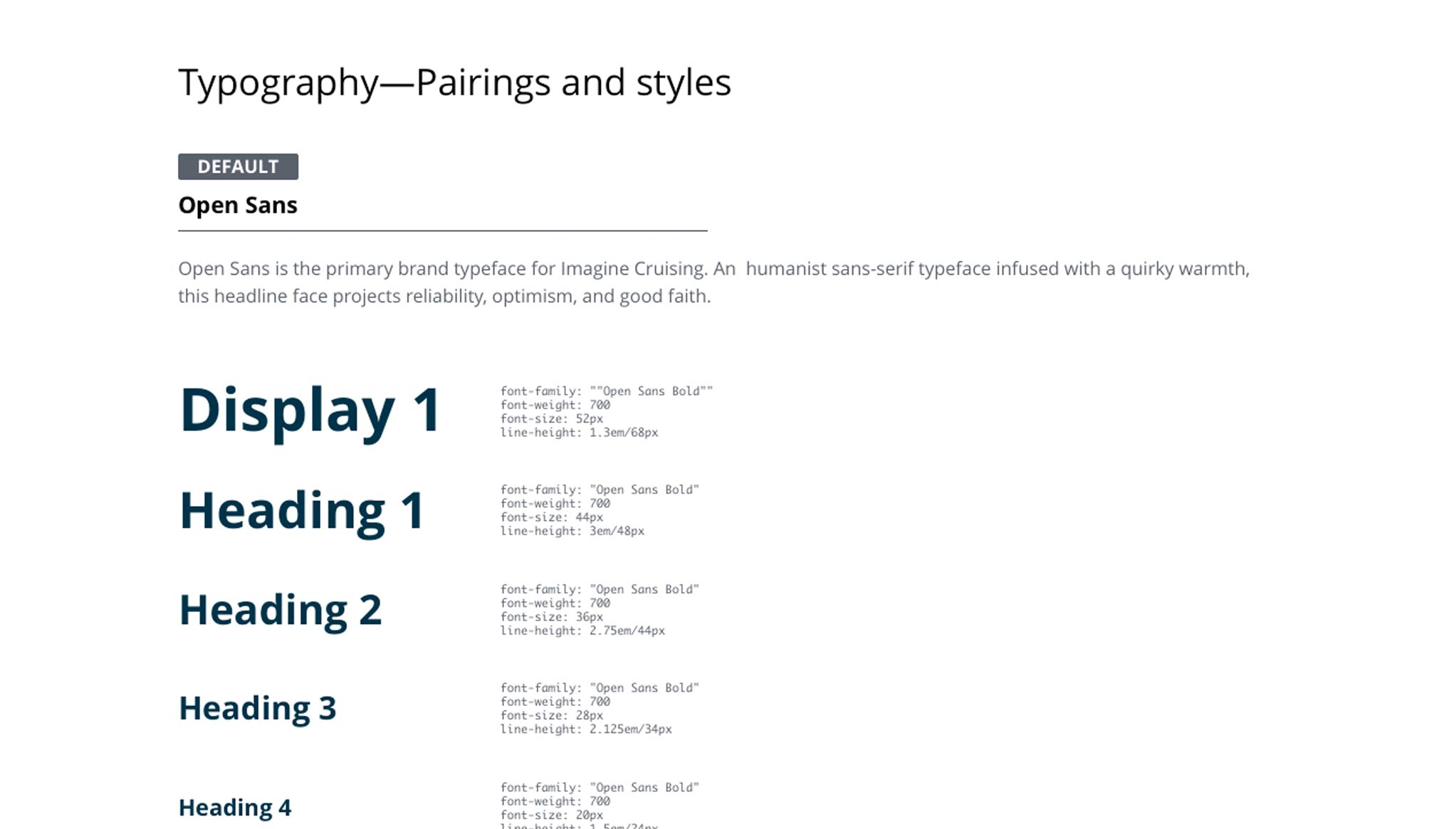 ^ Pairing typography & CSS attributes
I needed to gain support from the stakeholders before I embarked on building the system. From my research I knew it wasn’t going to be a quick fix and there was a significant amount of development and design work which would require budget sign-off. I spoke personally to the stakeholders and reiterated the benefits of implementing a system. I highlighted the design inconsistencies that company had, the opportunities the research uncovered and how the system would have a positive effect on the user experience.
 ^ Building with scalability in mind
When designing the new system, I chose to adopt the “atom design” methodology to help with creating simple building blocks. This way, I could drill right down into what a component was made of. It also gave full control of element styles, that could later be tokenized to synchronize style updates with ease.
After breaking out the UI atomically, I defined the appropriate properties and variants that the system was going to be made up of. Everything from theming, size, type, shape, style and state had to be considered. This was then parried up with the previous customer research. The research influenced elements such as default type sizes and meant there was an increase in button sizes to maximise clickable areas for the older demographic.
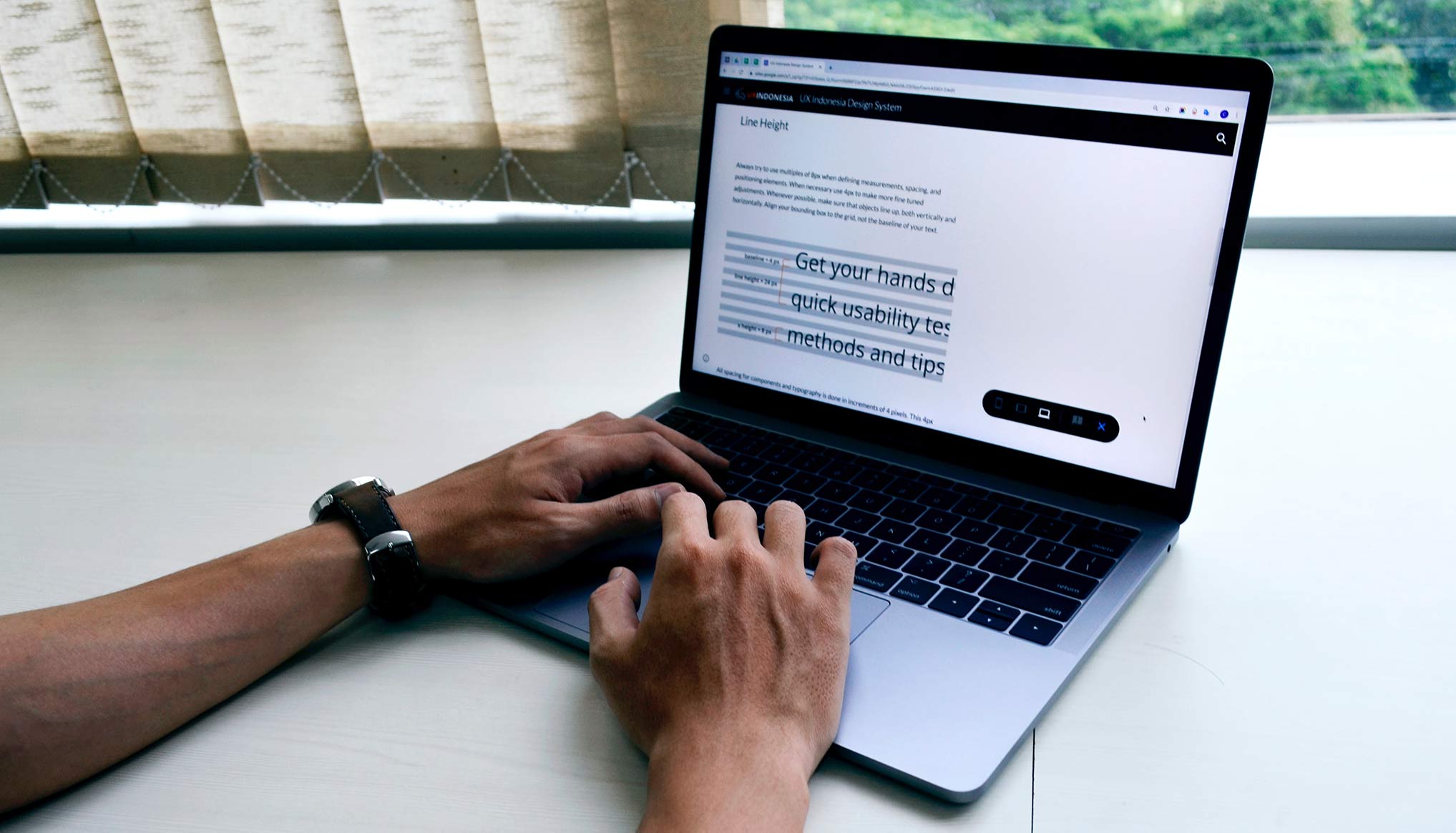
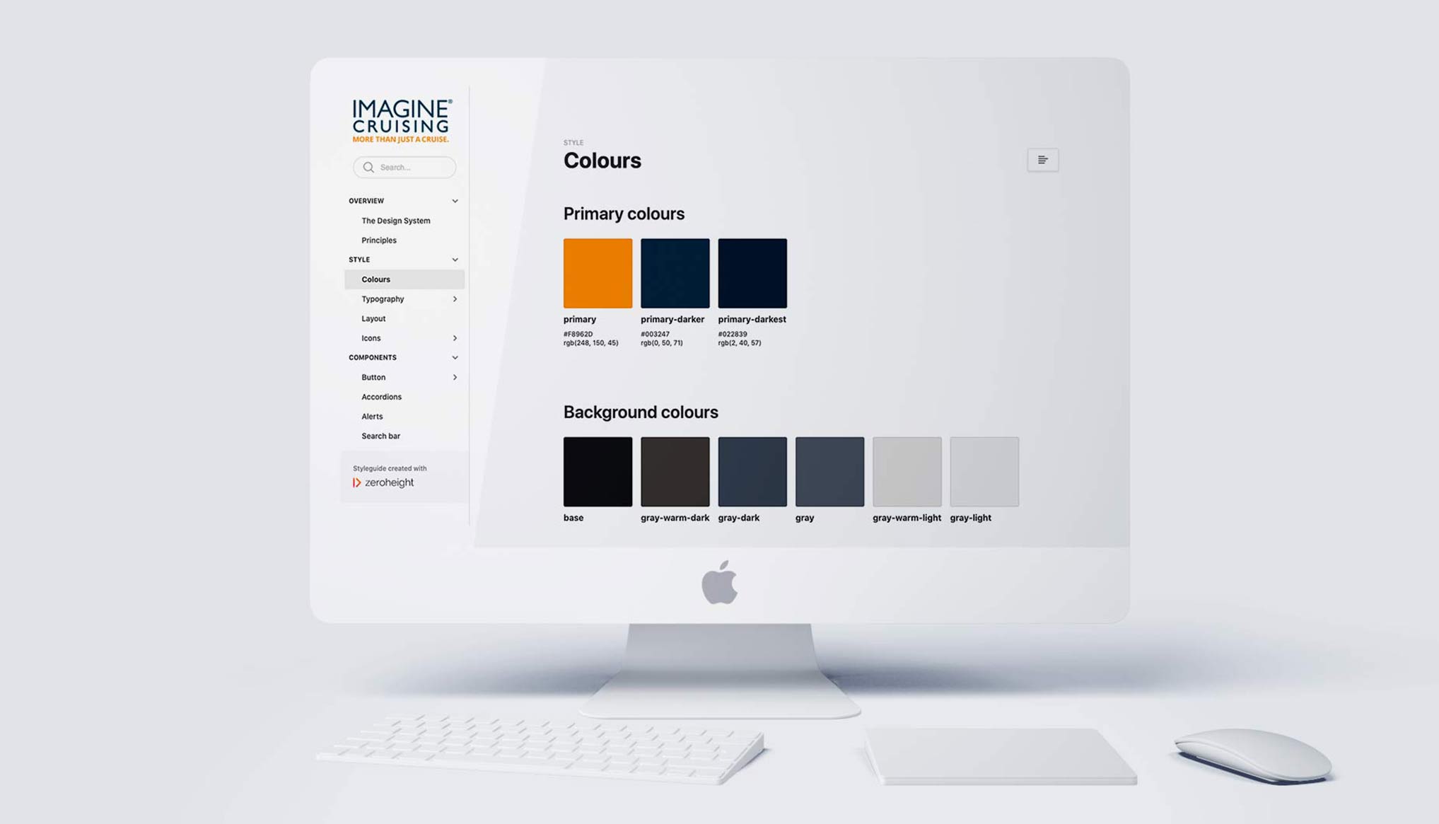
The grid, spacing, typography and colours formed the core foundations of the design system. Consistency and scalability were always at the forefront of my mind when I designed the building block components such as buttons, forms, and navigation. Everything had a high visual quality, whilst also being functional across browsers and kept flexible to hold a variety of content. Once designed, each element went into regression testing and had a range of different content and context assigned to see if the component was robust enough.
By fully exploring each potential use case for each individual component, I was able to see how page hierarchy played out and how much cognitive load each UI element required. This then fed back into templating styles and decided what could sit on the grid at the same time.
I also baked accessible design into the system. Colour ratios were closely scrutinised and type scale and spacing selected based on reading ages and abilities. With adopting such a flat design system, affordance became a key player too. I made sure buttons looked like clickable elements, ensuring with the use of focus states, that they looked actionable.
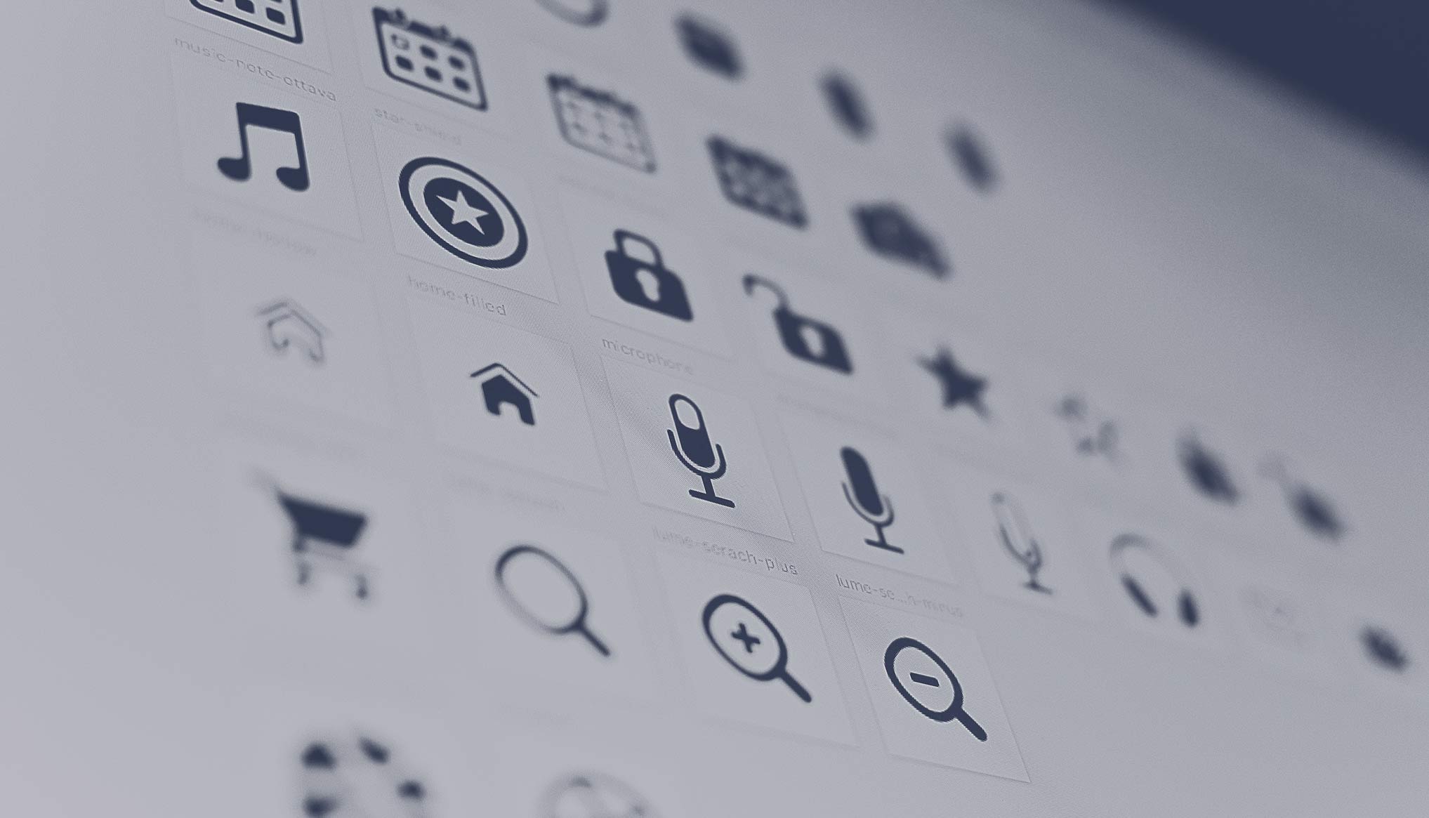 ^ Choosing the right iconography
I used supplementary documentation to ensure the elements had proper adoption. The aim of this documentation was consistency. I knew that consistency with terminology and consistency in understanding would be key to getting the system off the ground.
Everything that lives in the design system was well defined in documentation. I added enough detail to ensure that that anyone could pick it up and know what a component is and when they should use it. I included the name of the component/element, a brief description, any assigned guidelines, examples of what/what not to do and code snippets for the developers to grab.
With the documentation set up on a google drive I was able to insure each element had the right integration to the new platform. In addition, this documentation future proofed any development moving forward.
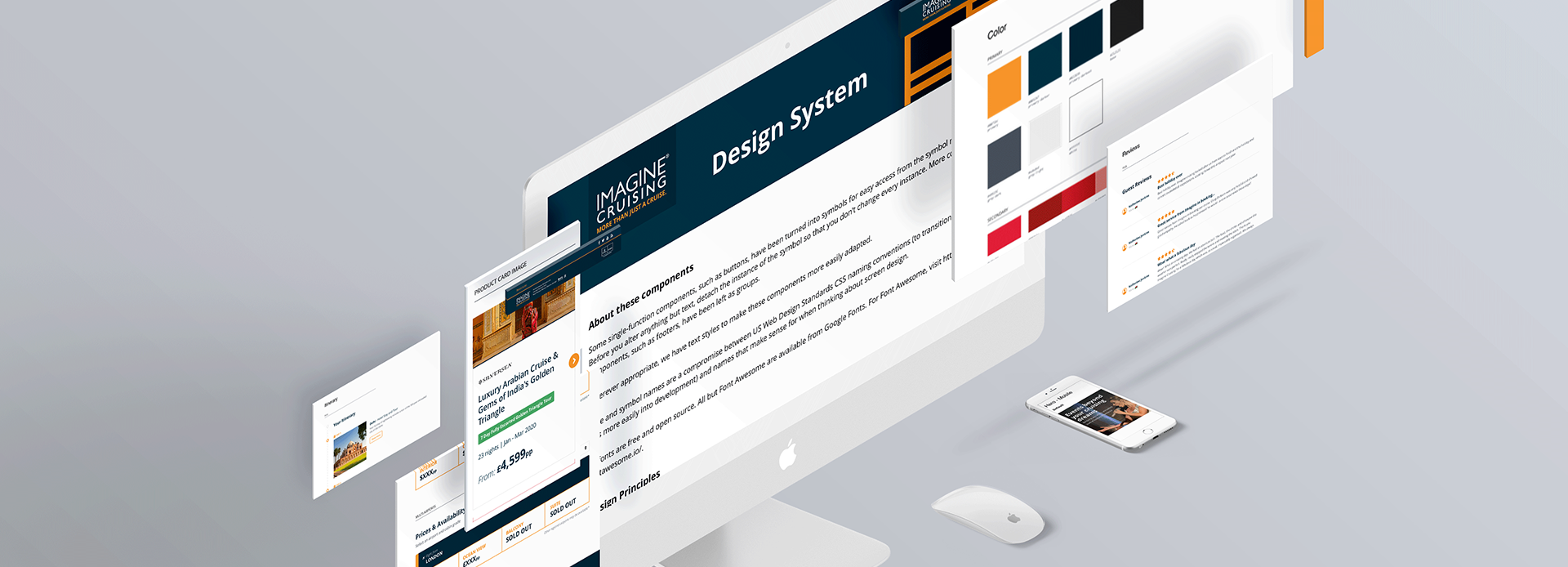
Once the main documentation was completed, I created a UI style guide in zeroheight. This platform acted as a central hub for the system, which allowed for ease of use. As well as acting as a place to organize the design system, it was also an easy tool for designers on the team to sync from sketch. It also had an option for tokenization, which was key for future proofing the project. Next, I focused on the exiting part of the process – the build and implementation of the system across the website.
 ^ Building out the pattern library
A fully revamped brand, better focused UX/UI, and a design system based on scalability.
I built a collection of accessible, usable and repeatable components with an accompanying set of standards guiding the use of these components. As the new design system was being tested and rolled out, I discussed optimisation with developers and developed a process to make these changes smoother. The logical next step to evolve the system was to look into tokenization and building micro services in the tech stack.
By connecting the dots and getting the design tools needed to communicate with the development stack, we could use a simple “pull” command to update and synchronize style updates. This would help us optimize the workflow and empower the right people to make changes and ensure consistency.
Design Lead
Imagine Cruising
2019
Design Systems
Design Ops
Documentation
Sketch
Invision
Reimagining a holiday search journey.
Native screens and dashboard design.
Creation of a fresh brand identity.